
底域專欄 4 分鐘
幻彩|讓顏色成為一條路|When Color Becomes a Path
文|底域
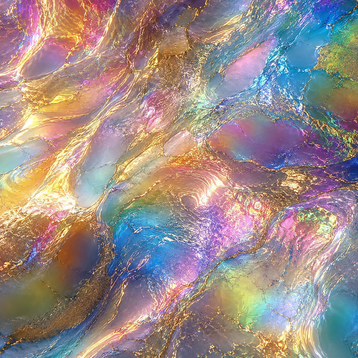
色彩不是覆蓋在礦物上的表面,而是一條從它身上開始的路
幻彩從一個很直接的問題開始:顏色如果不只是一層附著在表面的裝飾,還能成為什麼?
一件礦物原本就有自己的顏色、透度、光澤與質地。它不是等待被填滿的空白,也不需要被重新畫成另一種東西。當色彩進入作品,必須先遇見這些已經存在的條件,再從中找到可以繼續前進的方向。
所以幻彩不替礦物畫上一幅風景,也不讓顏色把它原本的樣子蓋過去。
顏色沿著晶體允許的方向移動。從一個色相走向另一個色相,在明暗、反光與材質之間慢慢轉變。礦物仍然是礦物,色彩則在它周圍形成另一種流動的時間。
一個顏色是一個位置。
顏色開始移動,才成為一段經驗。
幻彩不是很多顏色
幻彩不是把幾個漂亮的顏色放在一起。
紅、橙與黃可以同時出現,但真正重要的不是它們各自有多鮮明,而是紅如何進入橙,橙又如何把光帶向黃。顏色之間需要有方向,也需要有一段能被視線走過的距離。
目前的幻彩沿著色相輪建立路徑:紅走向橙與黃,黃經過綠進入藍,藍向靛與紫沉下去,紫再回到紅與橙。每件作品只取其中一段,不需要把整個色輪全部帶走。
因此,幻彩選擇的從來不只是三個顏色,而是一條色彩準備如何發生的路。
同一條路也不會產生相同的作品。紅、橙、黃落在透明的黃金利姆上,可能像尚未熄滅的火;落在灰度更高的晶體上,卻可能變成土、鐵鏽與被時間壓低的餘光。
路徑可以相同,抵達的世界仍然不同。
礦物先決定邊界
幻彩的設計順序不是先決定主題,再要求礦物配合。
要先看晶體。
看它有多明亮、多透明,表面如何反射光,又有哪些包裹、覆蓋與生長痕跡。這些條件會決定顏色能走多遠,也決定作品應該在哪裡停下來。
高明度的晶體可以承接較清亮的色彩;灰度升高之後,黃色可能沉成土黃,綠色落進苔綠,藍色則轉向灰藍與鉛藍。顏色沒有消失,只是進入了更深、更安靜的位置。
當彩度降低,金屬性的微光也會變得重要。它讓顏色在灰暗之中仍然保有移動,避免整個表面凝固成幾塊平坦的色塊。
色相決定方向。
明度決定深淺。
彩度決定強弱。
晶體決定限制。
意象決定作品最後走向哪裡。
這些限制不是為了讓幻彩變得安全。
正好相反。只有邊界出現,色彩才真正開始形成自己的力量。
意象不是畫上去的
作品的意象不是預先準備好的題目,也不是一幅需要被重現的景色。
它通常出現在色彩開始移動之後。
《餘燼之光》從紅走向橙,再抵達黃。那不是把火焰畫在礦物上,而是讓熱、殘光與燃燒之後仍未完全熄滅的亮度,從色彩的方向裡慢慢出現。
《天穹之眼》則從藍進入紫與紅。藍色仍帶著距離,紫色讓天空開始失去白日的邊界,最後出現的紅,像晝夜交替時留在遠方的一道裂口。天空沒有被描繪出來,觀看卻已經從地面走向更深的地方。
《白境》站在另一個極端。它不依靠色相的連續位移,而以高明度、霧、散射與細微的冷暖變化承載晶體。當顏色接近白,流動沒有停止,只是變成光與空氣之間更難察覺的差異。
黑色也是如此。它不是一片完全封閉的黑,而是石墨、炭色、藍黑與紫黑之間的深度。輪廓必須仍然存在,光才能讓人知道黑暗有多深。
意象不是附加在作品上的故事。
它是礦物、色彩與觀看相遇之後,自然升起的東西。
七段流域,兩個極點
幻彩將色輪拆成七段可以持續流動的路徑。
餘燼流域由紅走向橙與黃;曙野流域從橙經過黃進入綠;青潮流域讓黃、綠與藍交會。接著是沉入綠、藍與靛的深林,走向藍、靛與紫的星夜,再由紫回到紅與橙,形成蒼穹與冕火。
它們不是七套固定配色,也不是七種已經完成的情緒。
它們更像同一股色彩,在不同方向與力量之下形成的流域。有些向光靠近,有些逐漸沉下去;有些仍保留熱度,有些開始拉開距離。
白境與深淵則位在兩端。當色相被推向極亮或極暗,原本的色彩差異開始退去,作品便從流動轉向對比、散射、吸收與深度。
COLOR FIELD 將這些路徑收進同一顆持續變化的核心。選擇一個色場,不是選擇一顆紅色、藍色或紫色的球,而是看同一個核心如何在不同的色彩力量中重新組成自己。
實體作品也是如此。
幻彩一直只有同一個核心。改變的是礦物、色彩流動的方向,以及觀看者進入它的方式。
顏色最後進入人
顏色被看見之後,很快就會離開顏料本身。
紅橙黃可能帶來熱、勇氣與尚未熄滅的感覺,也可能讓人想起黃昏、鐵鏽或某段已經很遠的記憶。藍紫紅可以通往夜空、距離與感知,也可能只是讓人安靜地停在一件作品前。
同一條色彩路徑,不會把所有人帶到相同的地方。
記憶、文化、身體與當下的狀態,都會改變顏色進入人的方式。脈輪、情緒與晶體象徵可以成為觀看的入口,卻不應把一件作品鎖進單一的解釋,更不是替礦物指定一種固定功效。
幻彩不替人決定感受。
它只替感受留下一個可以發生的位置。
因此,幻彩真正承載的不是某一種情緒,而是感知開始改變的那個瞬間。
視線先被顏色帶走,接著注意到晶體的光、重量與形狀;再停留久一些,意象與記憶才慢慢進入。這些事情不是依序發生的,它們彼此覆蓋,也不斷改變作品正在呈現的世界。
幻彩所做的,只是讓這段移動變得可以被看見。
—
Color Is Not a Surface Placed over a Mineral, but a Path That Begins with It
SPECTRA begins with a direct question: if color is more than decoration applied to a surface, what else can it become?
A mineral already carries its own color, transparency, luster, and texture. It is not an empty surface waiting to be filled, nor does it need to be painted into something else. When color enters the work, it must first encounter what is already there and discover where it is allowed to continue.
SPECTRA does not paint a landscape onto a mineral, and it does not allow color to conceal the mineral beneath it.
Color moves in the direction the crystal permits. It passes from one hue into another, changing through light, shadow, reflection, and material. The mineral remains a mineral, while color forms another kind of time around it.
A single color is a position.
When color begins to move, it becomes an experience.
SPECTRA Is Not Many Colors
SPECTRA is not the arrangement of several beautiful colors.
Red, orange, and yellow may appear together, but what matters is not how vivid each color becomes. What matters is how red enters orange, and how orange carries light toward yellow. There must be a direction between colors—a distance the eye can travel.
The current SPECTRA system builds its paths along the hue wheel. Red moves toward orange and yellow. Yellow passes through green into blue. Blue descends into indigo and violet, while violet returns through red toward orange. Each work follows only part of this movement. It does not need to carry the entire spectrum.
SPECTRA does not simply choose three colors. It chooses how color is about to happen.
The same path will not produce the same work. Red, orange, and yellow on a clear Golden Healer may resemble a fire that has not yet gone out. On a mineral with a higher grey value, the same path may become earth, rust, and a remnant of light pressed down by time.
The path may remain the same. The world it reaches does not.
The Mineral Draws the Boundary First
The design process does not begin with a theme and then force the mineral to obey it.
It begins by looking at the crystal.
Its brightness and transparency. The way its surface receives light. Its inclusions, coatings, and traces of growth. These conditions decide how far color can travel and where the work must stop.
A bright crystal may hold clearer color. As the grey value rises, yellow can settle into ochre, green into moss, and blue into slate or leaden tones. Color has not disappeared. It has simply entered a deeper and quieter place.
When saturation is lowered, subtle metallic reflection becomes important. It keeps color moving through the darker surface and prevents the work from hardening into several flat blocks.
Hue determines direction.
Brightness determines depth.
Saturation determines strength.
The crystal sets the limits.
Imagery determines where the work eventually goes.
These constraints are not meant to make SPECTRA safe.
The opposite is true. Only when a boundary appears can color begin to form its own force.
Imagery Is Not Painted onto the Work
The imagery of a work is not a subject prepared in advance, nor a landscape waiting to be reproduced.
It usually appears after color begins to move.
In 《餘燼之光》, red passes into orange and finally reaches yellow. Fire is not painted onto the mineral. Instead, heat, afterglow, and the brightness that remains after burning emerge through the direction of color.
《天穹之眼》 moves from blue into violet and red. Blue still carries distance. Violet begins to dissolve the boundary of daylight. The red that follows resembles a fracture left on the horizon as day turns into night. The sky is never illustrated, yet the gaze has already left the ground.
《白境》 stands at another extreme. It does not depend on continuous movement between hues, but on brightness, mist, diffusion, and subtle changes between warm and cool whites. As color approaches white, movement does not disappear. It becomes a difference between light and air that is harder to see.
Black follows a similar principle. It is not an entirely sealed darkness, but a depth formed between graphite, charcoal, blue-black, and violet-black. The outline must remain visible for light to reveal how deep the darkness is.
Imagery is not a story attached to the work.
It is what rises naturally when mineral, color, and perception meet.
Seven Fields, Two Poles
SPECTRA divides the hue wheel into seven paths of continuous movement.
Some move from red through orange to yellow. Others pass from orange into yellow and green, or from yellow through green into blue. The paths continue into green, blue, and indigo; then blue, indigo, and violet; before violet returns through red toward orange.
They are not seven fixed palettes, nor seven completed emotions.
They are closer to seven fields formed by the same body of color under different directions and forces. Some move toward light. Some descend. Some retain heat, while others begin to create distance.
The White Field and the Abyss stand at the two poles. As hue is pushed toward extreme brightness or darkness, chromatic differences begin to retreat. The work shifts from hue movement toward contrast, diffusion, absorption, and depth.
COLOR FIELD gathers these paths into a single core that is always changing. To choose a field is not to choose a red, blue, or violet sphere. It is to watch the same core recompose itself under different chromatic forces.
The physical works follow the same principle.
SPECTRA has always had one core. What changes is the mineral, the direction of color, and the way a viewer enters it.
Color Eventually Enters Us
Once color is seen, it quickly leaves the pigment behind.
Red, orange, and yellow may carry heat, courage, or the feeling of something not yet extinguished. They may also recall dusk, rust, or a memory that has travelled very far. Blue, violet, and red may open toward night, distance, and perception—or simply make someone remain quietly before a work.
The same path will not take everyone to the same place.
Memory, culture, the body, and the condition of the present moment all change the way color enters a person. Chakras, emotions, and crystal symbolism may offer ways into the work, but they should never close it inside a single interpretation or assign the mineral a fixed effect.
SPECTRA does not decide what someone should feel.
It leaves a place where feeling can occur.
What SPECTRA carries is not one particular emotion, but the instant in which perception begins to change.
The eye follows color first. Then it notices the crystal’s light, weight, and form. With more time, imagery and memory begin to enter. These things do not happen in a clean sequence. They overlap, continually changing the world the work presents.
SPECTRA simply allows that movement to become visible.